
DURATION
4 months
TEAM
Satveer Kaur
Enija Ward
Jheron Abellar
Jessica Paz
Jiahui Su
MY ROLE
UX Researcher
UX Designer
Logo Designer
Video Producer
Why did we design this product?
Due to the pandemic, many companies change their working mode from in-person to remote. We believe that even though the pandemic pass, remote working will still be a popular mode in the future. However, remote working leads to team collaboration issues, people are getting hard to have great communication like in person. To solve the issues, team-building and bonding events are necessary. Therefore, we decided to design a website for people can easily discover, plan, and host team-building/bonding events online in an engaging way.
About Synergy
Synergy is a remote team-building and bonding platform for professionals. The application allows users to discover activities, plan events, and host team building and bonding sessions all in one place. Team facilitators, our target users, are provided with the tools needed to help their teams to learn and grow while building bonds. The virtual sessions offer multiple ways to interact with members during sessions while preserving and closely mimicking real-life interactions.
Logo Design


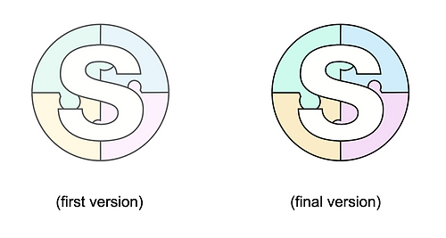
After I decided to design the logo using the first letter "S" of "Synergy", I made three sketches to show different design ideas. Our team prefers the second one because we think the puzzle pieces can better show the meaning of the word "Synergy". Based on the team's suggestions, I change the puzzle pieces to the background and keep the letter "S" in white to have a stronger visual. We made three tries based on changes, they are square shape, diamond shape, and round shape. We ended up picking the round shape because it can best show the puzzle pieces and not be hidden by the letter "S". In the final production, I use a darker tone of the color pad as the logo color. That will help the logo be more eye-catching and can show up on the website.
Research


Primary User - Team Facilitator
Secondary User - Team Member
Early on, our team was interested in the domain of virtual spaces and applications that help people to feel connected with each other. We began initial immersions by taking notes on scholarly research and online articles in order to understand the problems as well as existing solutions surrounding this topic. We then narrowed our scope even further into a virtual space that could help with remote team building, since we thought that this would be an exciting challenge. After deciding on this domain, we conducted interviews with users that had either participated in or planned team-building sessions. This helped us to record some general information about their relationships with these kinds of products, what products they use, as well as any frustrations that they had.

After all of the interviews, while we were able to decide on a direction to go, we did run into problems when we started to define who are users were. We still felt that maybe we didn’t have enough data and we began to make assumptions about what our users’ motivations and goals were. This led to difficulties later on when making design decisions. So we repeatedly had to go back and forth with researching our users to fill in these perceived gaps. We created a survey and send it to the UX online communities to get more information. However, the information we got is still limited. That held us back from moving forward from this initial stage.

Having recognized our problem, our next steps were figuring how what we should do next. Although having a lot of research is excellent for building a solid foundation in which we can back up our design decisions, we did have to decide at a certain point that we had enough information. Making that decision was not easy. We faced dilemmas if what we had was enough and how to use what we had efficiently. After many discussions, we agreed that we could find a balance between data and our knowledge. Not all decisions have to be made with research data backing it up. Our experience from past projects is just as valuable as data obtained from multiple types of research. So, we used what we learned, supplemented with our research, to fill in the gaps in our platform. This approach worked well to keep us moving forward and allowed us to discover the essential skill of utilizing all types of knowledge to our benefit.
Define

After developing our idea and researching our competitors we struggled to explain to people outside of our team how our application was unique from similar products that were already on the market. In order to fix that we decided to do a competitive analysis of our direct competitors. We focused more on the features they had to offer and how they executed them. Once we finished our analysis we learned what was necessary for our product to be successful and it helped give reinforcement on our design choices. But it still didn’t help us explain what our product is to others. Because of that, we decided to build a Geoffrey Moore positioning statement.

This statement explains who our target demographic is, the need for our product, and its key benefit to the customer. We decided that part of our uniqueness would be the fact that we are a one-stop-shop. Our product is for team facilitators who are looking for a platform that makes it easy to increase their team's productivity and project outcomes. Unlike our competitors, Synergy is a team-building and bonding platform that provides the ability to discover activities, plan remote events, and host remote sessions all in one place.
Ideate

Our process of ideating our site features began with mindmapping and brainstorming some potential concepts that could address our user’s needs. We then combined all of our individual ideas that we thought were really compelling and we organized them through a card sorting activity. Lastly, we decided on how we could lay out all of these features by creating a site map, which would later help us with prototyping.

We did encounter some issues when creating our site map, however. We weren’t able to communicate many of our ideas effectively through words alone, and this made it difficult to align our overall vision for our product. So to compensate for this, we decided that we would each create low-fidelity sketches of wireframes that demonstrated some of our individual ideas for the site’s layout and flow. This helped us tremendously with explaining our concepts as well as picking and choosing which core interactions that we wanted to focus on.


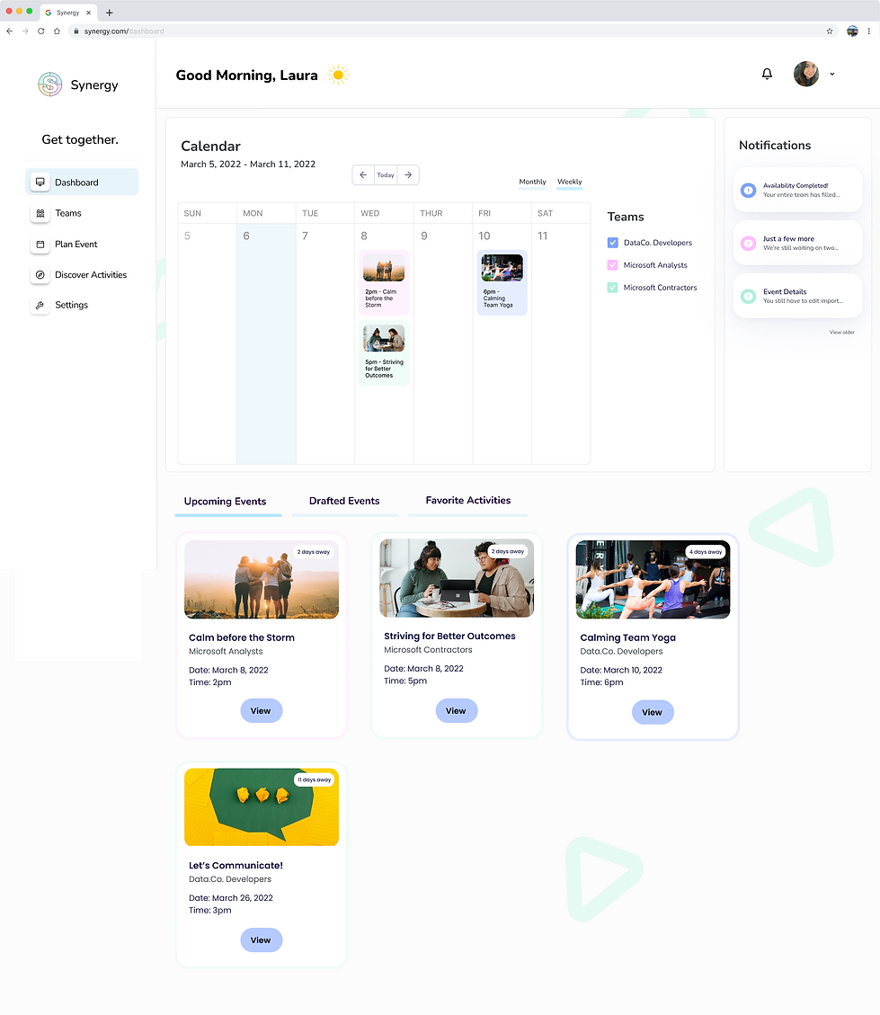
These are some of the initial individual sketches that our team members made to show what we envisioned for our website. Each of us had a different idea of what this page would look like as well as its contents. After creating these sketches, our team was finally able to reach a consensus on what would be included on different website pages. We ended up using the most helpful features from our sketches for creating our prototype. For example, the "Dashboard" includes a personal weekly calendar, a join event button, upcoming events, and favorite activities; the "Discover Activities" includes side navigation, activity card shape, favorite activities mark, activity filter, and user profile/account; "Plan Event" includes adding cohost, and sending email invitations.
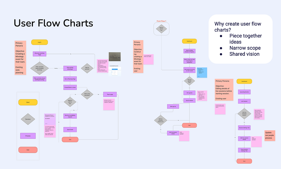
The user flow chart was essential for us to piece together our ideas, narrow the prototype’s scope to deliver the minimal viable product for the capstone, and allow every member to stay aligned to our final product vision. Since this artifact would be the blueprint we followed in our prototype and test phase, we had a lot to discuss as a team. To help us mitigate the issues of excessive discussions on minor details, we revisited and updated the scenario of the user flowchart and added sticky notes that gave more information where it was needed.
Prototype & Test


After creating our wireframes and user flow, we started to create the prototype. In order to keep our prototype consistent from screen to screen, we created our own style guide for us to follow. We first designed a low-fidelity prototype, a simple and quick first draft of our concept. Then we made edits and revamped the interface to feel more realistic and viable. There are a few of the drafted screens for the low-fidelity prototype, as well as their updated, high-fidelity versions.

First, we originally wanted to keep all of the events on the user's dashboard at once, one category underneath the other. Though, we realized that existing users with plenty of events here would have a very lengthy dashboard which would make it hard to get to what they need. There are many reasons why we didn’t go with previously proposed solutions like horizontal scroll disadvantages and number of clicks, though our final decision was to add the clickable tabs you see to the right, so that users only have to see the events they need to see at that moment, and a vertical scroll to minimize the interaction learning curve.

Another issue we ran into was that our original planning process was designed in a step-by-step format which was helpful, though it was long and repetitive, and this could be frustrating for users that didn’t want guidance or just wanted to get through these screens quickly. Our final decision was to keep some of this guidance to ensure users knew the important steps before proceeding, for example, team details and availability request reviews, and to keep other parts of this process on a general planning page to be edited from there. This breaks up the number of screens they have to click through to complete the task while providing just enough information to reduce errors.

Lastly, we made a decision on the live session screens. In our initial concept creation, we wanted to allow the users to customize their session backgrounds based on the specific events they were in - though when we started adding the background we realized that it was very distracting and unprofessional-looking. We decided to use this triangle illustration that has been used throughout our product instead which worked much better. With more time, our team would look into how to add in specific event backgrounds without it overpowering the interface.

For usability testing, two of the categories we used to sort the feedback we got were 1) Critical - which are things that might stop the users from completing a scenario and 2) Serious - which are things that many users will be frustrated by, possibly causing them to give up. 3) Minor - which are things that users are annoyed with, but this does not keep them from completing the scenario. Revisit. After this, we separated them into a chart to prioritize our work and time since this was limited. The "Do it now" section was things that were meager effort that had high value, and the "Make time for it" section on the right shows things that had high value but required a little more effort. Below the chart shows the sections "Busy work" and "Time sinks", where we put things that were either on the low value and low effort or low value and high effort scales. Here, we recognized that these things might take a lot more time and effort than we had the capacity for. This feedback is still very valid and valuable to our team. In future iterations of this project, we would love to revisit them further to improve the usability and desirability of our product.


Based on the feedback we got from the usability test, we made some changes to our design.
-
We got feedback that people get confused during the planning process, such as the "Group's Availability" function, so we decided to add tooltips to the planning page to explain parts of the process and used the question mark as the icon. The previous chart is not clear for users to check the group's availability, inspired by the "when to meet", we added a color key for availability on the planning screen.
-
For the activity details screen, we added more details like drinks, etc.; added hashtags/keywords for activities that allow users to know about an activity roughly in a short time. We also changed team size from small-large to 4-100 which is more specific; changed “Time needed” to “Time duration” to make it clearer and more understandable.
-
The third thing we made changes for is the navigation. We changed "Account" in the navigation to "Settings" because the account function already exists in a different place (top right), it should be called "Settings"; changed "Discover" in the navigation into "Discover Activities" which is more clear, the "Discover" make confusion to users, they not sure what are they will discover for.

We create a front story video to show how people can use Synergy to solve their team collaboration issues. In order to show it in a fun way, we decided to show a story happening to the main character Laura (a team facilitator). We believe that would help viewers know better about Synergy in a more immersed way. Before we start the video editing, we use a storyboard to brainstorm the video content and filming angles. Then, based on the storyboard, we design the video narration and set up the filming guide for each team member to film easier.
Front Story Video
High-Fidelity Prototype
Landing Page

Dashboard
Discover

Activity Details

Plan Event - Pre Availability Request

Initial Planning - Team Details

Initial Planning - Availability Requests

Email Invite (Attendee View)
.png)
Filling Out Availability (Attendee View)
.png)
Plan Event - Post Availability Request

Final Planning - Completed & Send Invitations

Live Sessions
.png)
Mixology
.png)
Back to Back
.png)
Escape Room
What can we improve? (Next Steps)
-
Make changes based on the sections "Busy work" and "Time sinks" of our usability feedback.
-
Meet with potential stakeholders and get more suggestions.
-
Do the second-round useability test.